


Case Study:
Beach Theater Mobile App

Project Overview
The Problem
Users need a way to watch trailers and read reviews before purchasing a movie ticket.
The Product
Beach Theater wants to create an app for their local business that will allow users to watch movie trailers, read reviews and purchase movie tickets.
My Role
UX Designer & Researcher (Project 1 for Coursera’s Google UX Design Certificate Program)
The Goal
Design an app for Beach Theater that allows users to easily watch movie trailers, read movie reviews and purchase a movie ticket through an app.
Responsibilities
My responsibilities throughout the project included user design and research, wireframing, usability testing, competitive auditing, iteration on design and lo-fi/hi-fi prototyping.
Tools Used
Figma, Paper, Marker
Project Duration
August 2021 - January 2022
Understanding the User
I conducted interviews with several people of various age groups to better help understand who I am designing for and what their needs are.
The needs varied based on the age groups with regard to designing a trailer browsing app for a movie theater. For example, young families need a way to filter content that is age-appropriate and family-friendly for their children, where as older users who lacked experience with technology deterred to traditional analog methods of gathering information.
User Pain Points
Time
Users had to scroll through multiple previews and sit through ads between viewings.
Rating
Users needed to know if the films were age-appropriate and have good reviews.
Usability
Older users were not good with technology, especially smartphones.
Accessibility
Some users had to wait for reviews to come out and call to see if the movie was playing locally.
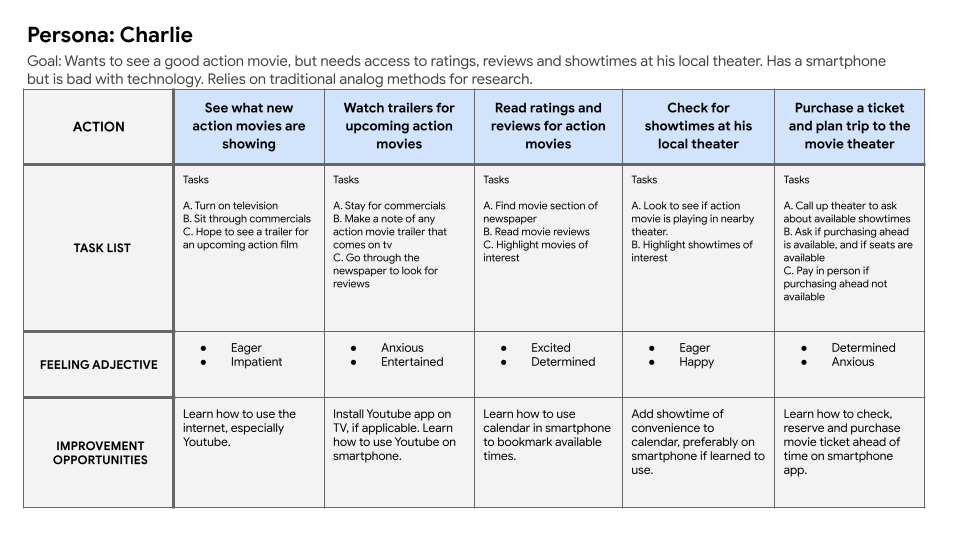
Persona & Problem Statement
Charlie is an action movie lover who isn’t good with technology who needs an easy way to access ratings, reviews, showtimes and ticket availability for his local theater because he’d like to go see a good action movie at his local theater.

User Journey Map
Mapping Charlie’s user journey showed how helpful it would be for users to have a dedicated movie trailer app with local showtimes and ticket purchasing availability.
Starting the Design
Paper Wireframes
Starting out by drafting wireframes on paper allowed for identifying areas of interest and iteration of themes that would highlight features to focus on while addressing pain points for users.
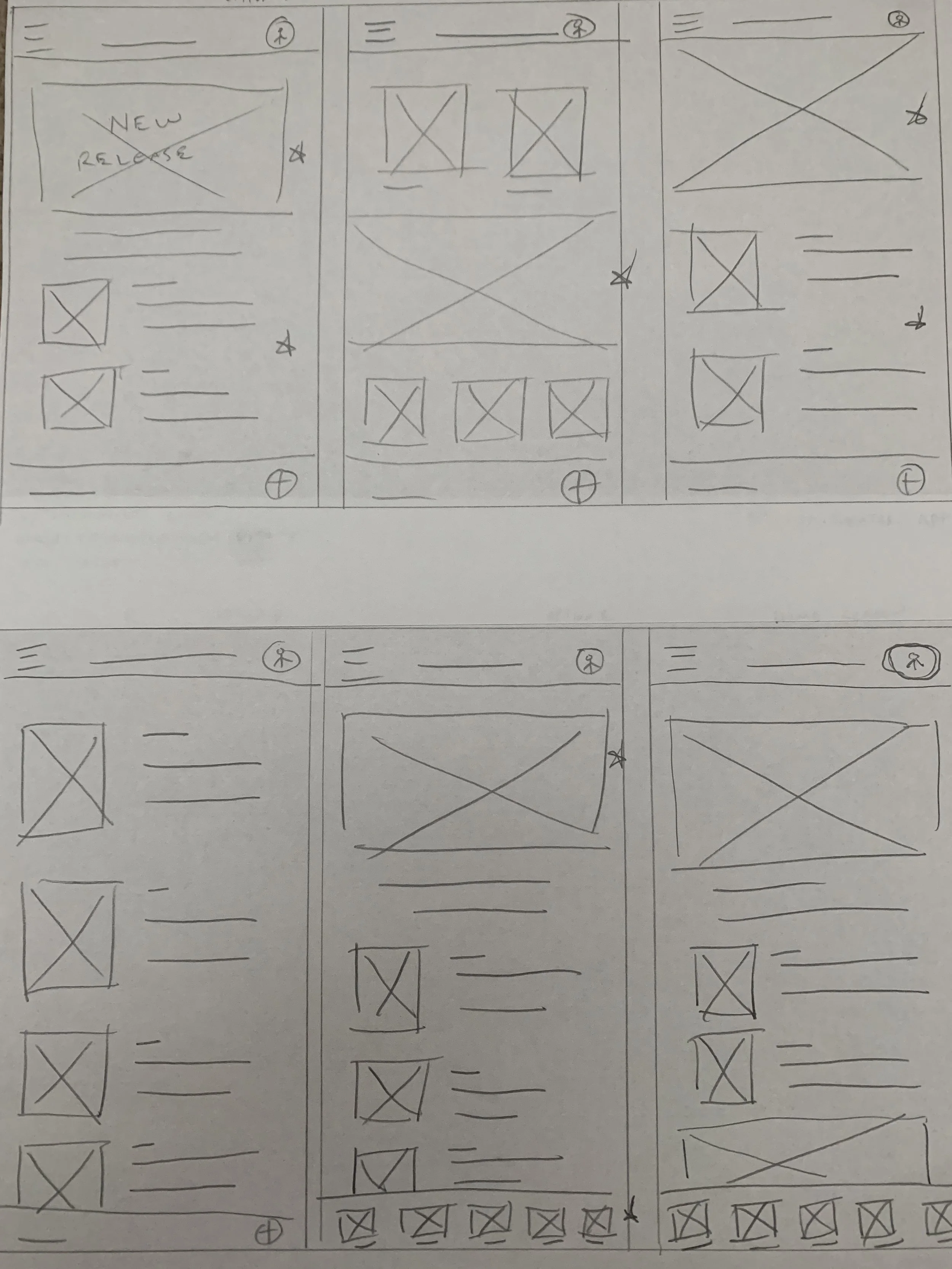
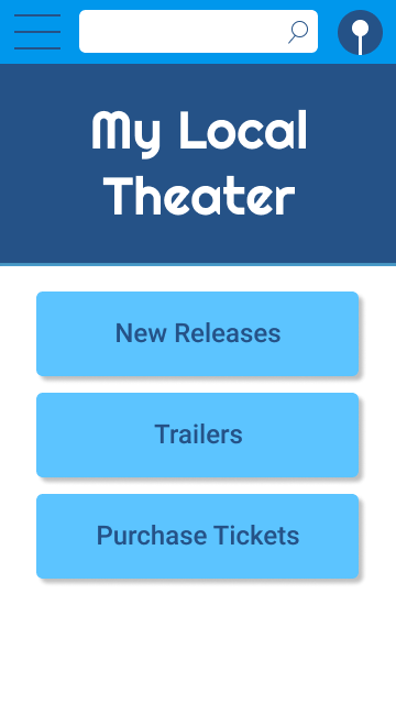
Digital Wireframes
Throughout the initial design phase, I based lo-fidelity screen creations on user research and feedback.
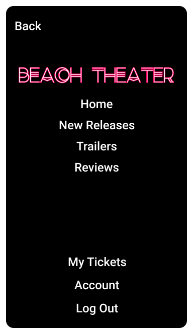
Users could easily return to the screen in use from the nav bar.
Easy access to navigation through the nav bar.
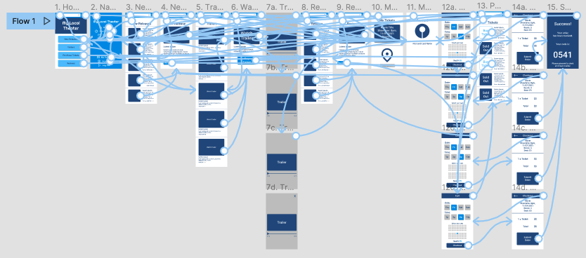
Lo-Fidelity Prototype
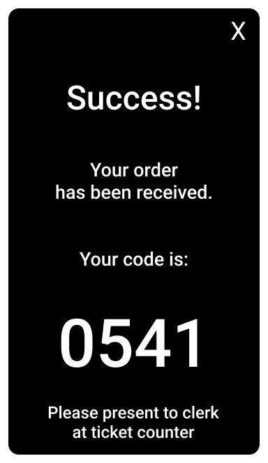
A lo-fidelity prototype was used for testing the user flow of navigating the app for watching trailers, reading reviews and purchasing a movie ticket. The initial prototype was then used for testing purposes in a usability study.
View the Beach Theater lo-fidelity prototype
Usability Study Findings
Two rounds of usability testing was provided for participants.
Round 1 Findings:
“Reviews” needed to be easily identifiable
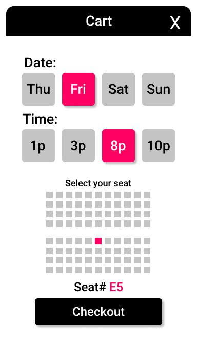
Showtimes needed to be available when selecting a time to see a movie
Reviews and Trailers needed to be main features on the Home Screen and Navigation Bar
Round 2 Findings:
Date and Time selection for picking a movie needed to be interactive
“Lorem ipsum” needed to be replaced with legible and easy to understand text
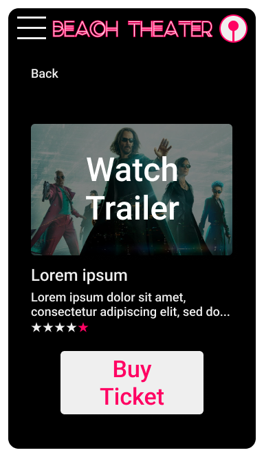
Movie trailers needed to be interactive
Refining the Design
Mockups
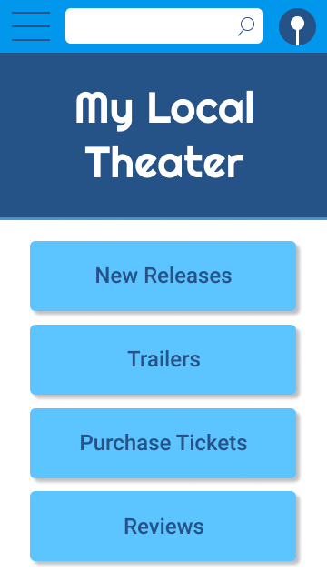
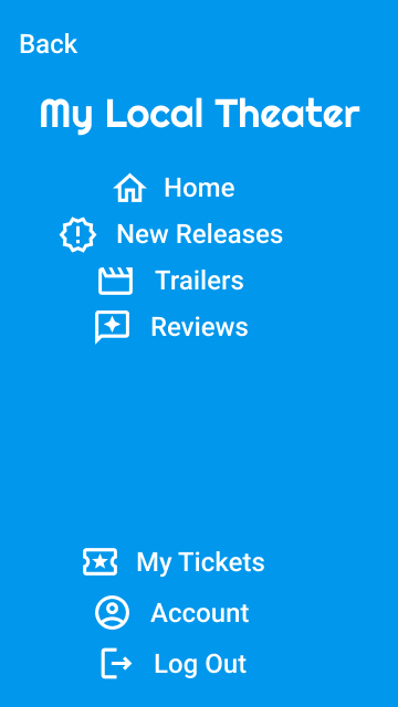
After the initial usability study, adding main features to the navigation was important to minimize user pain points, i.e., adding a quick navigation button for “Reviews”. Search was also omitted.
Before usability study

After usability study
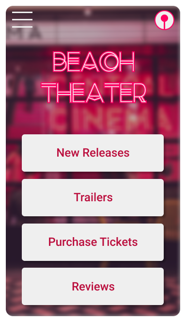
The second usability study revealed that users were not fans of the colors. The background was replaced for all screens.
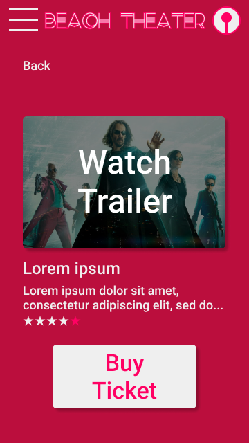
Before usability study

After usability study
Accessibility Considerations
Images
I used images to associate with movie titles and descriptions.
Navigation
I kept navigation simple and accessible to help with the user journey and minimizing pain points for the user.
Buttons
I made buttons large and kept details simplified to make navigation and usage of the app easier.


Hi-Fidelity Prototype
The hi-fidelity prototype presented cleaner user flow through transitions and animations, also meeting user needs for watching trailers and reading reviews in order to make a decision on purchasing a movie ticket.
View the Beach Theater hi-fidelity prototype

Going Forward
Takeaways
Impact
The app made users feel like Beach Theater really thinks about how to meet their needs.
One quote from peer feedback:
“This one was much better than the last. I like that I can see images and color now, and everything seems easy to find.”
What I Learned
While designing the Beach Theater app, I learned that the initial ideas for the app are not set in stone, and will go through multiple rounds of revision based on both ideation, collaboration, user feedback and such. Peer feedback and usability studies were influential toward each iteration of the app’s design.
Next Steps
Testing
Conduct additional rounds of usability studies to validate whether the pain points users experienced have been effectively addressed or need further iteration.
User Research
Conduct continued user research to determine any new areas of need as the app is improved and user journeys evolve through each future update.
Accessibility
Keep accessibility in mind in future iterations and revisions to the app to make use accessible to widest pool of users as possible.