


Case Study:
Petagogo Responsive Website

Project Overview
The Problem
Users needed a way to view available pets for adoption and schedule reservations for visitation.
The Product
Petagogo is a responsive website that allows users to schedule a visit with an adoptable pet.
My Role
UX Designer & Researcher (Project 2 for Coursera’s Google UX Design Certificate Program)
The Goal
Design a responsive website to give users the ability to view available pets for adoption and make reservations for visitation.
Responsibilities
My responsibilities throughout the project included user design and research, wireframing, usability testing, competitive auditing, iteration on design and lo-fi/hi-fi prototyping.
Tools Used
Adobe XD, Paper, Marker
Project Duration
January 2022 - February 2022
Understanding the User
I conducted interviews with several people of various age groups to better help understand who I am designing for and what their needs are.
The needs varied based on the age groups with regard to designing a responsive website flow for for viewing available pets for adoption and scheduling a reservation for visitation with potential adoptable pets. For example, a single mother of two is looking to introduce a pet in to home with her children to help encourage responsibility, where they can also grow and bond with the pet potential.
User Pain Points
Catalog Availability
Users wanted a way to find and view available pets to adopt through a catalog search.
Reservations
Users wanted a way to reserve a spot for visitation with a potential adoptable pet.
Persona & Problem Statement
June is a single mother of two who needs a way to look for an adoptable pet to introduce to her children and encourage responsibility while bonding and growing with it.

User Journey Map
Mapping June’s user journey showed how helpful it would be for users to be able to view available pets for adoption and schedule a reservation for visitation.

Starting the Design
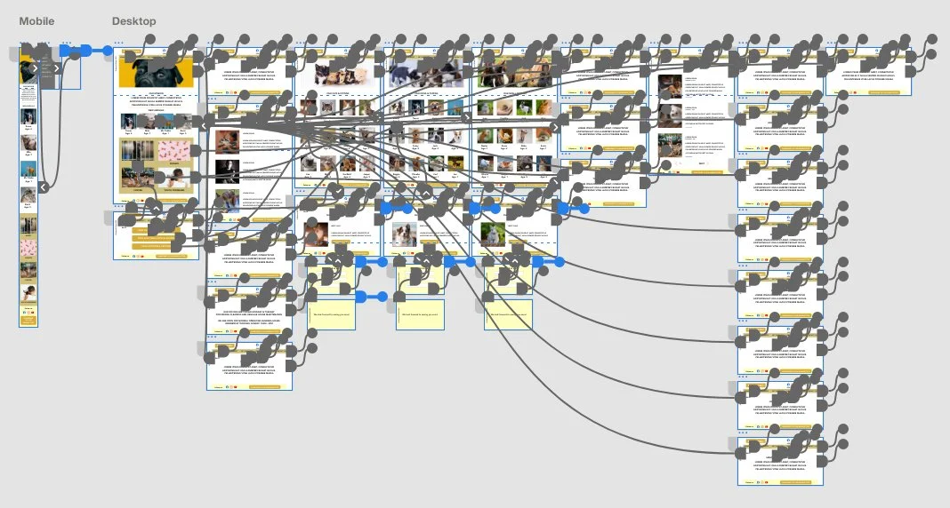
Sitemap
A Pet Adoption Sitemap was built to show all the different ways a user would interact with a responsive website when eager to enquire about pet adoption.

Paper Wireframes
Starting out by drafting wireframes on paper allowed for identifying areas of interest and iteration of themes that would highlight features to focus on while addressing pain points for users.
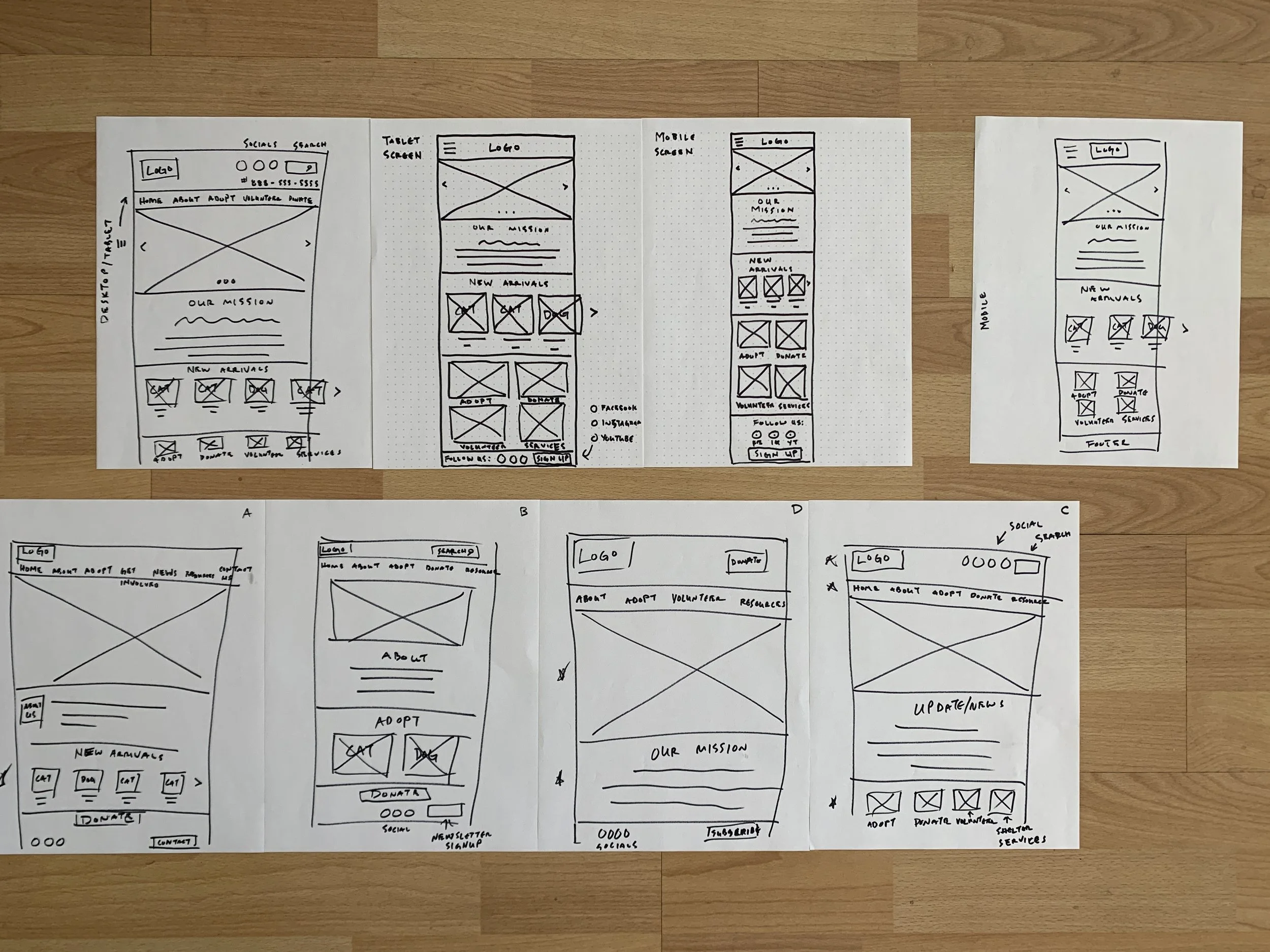
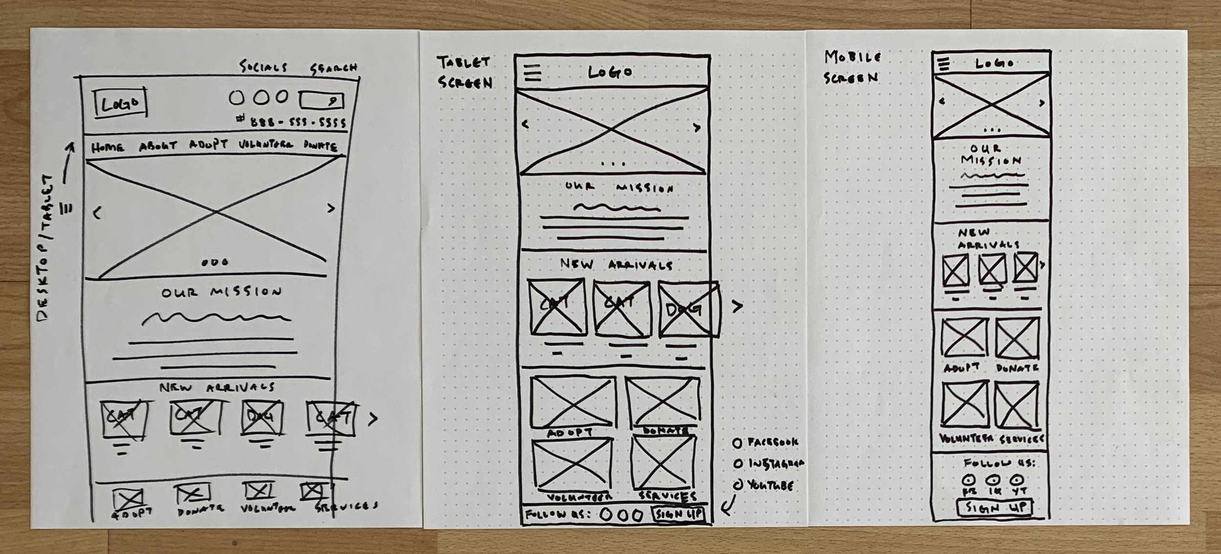
Paper Wireframe Screen Size Variations
The goal of this case study with regard to wireframing was to model similar flows for different device formats in relation to responsive design. Featured here (from left to right) is the paper wireframe of the home screen for Desktop, Tablet and Mobile Handset Device.
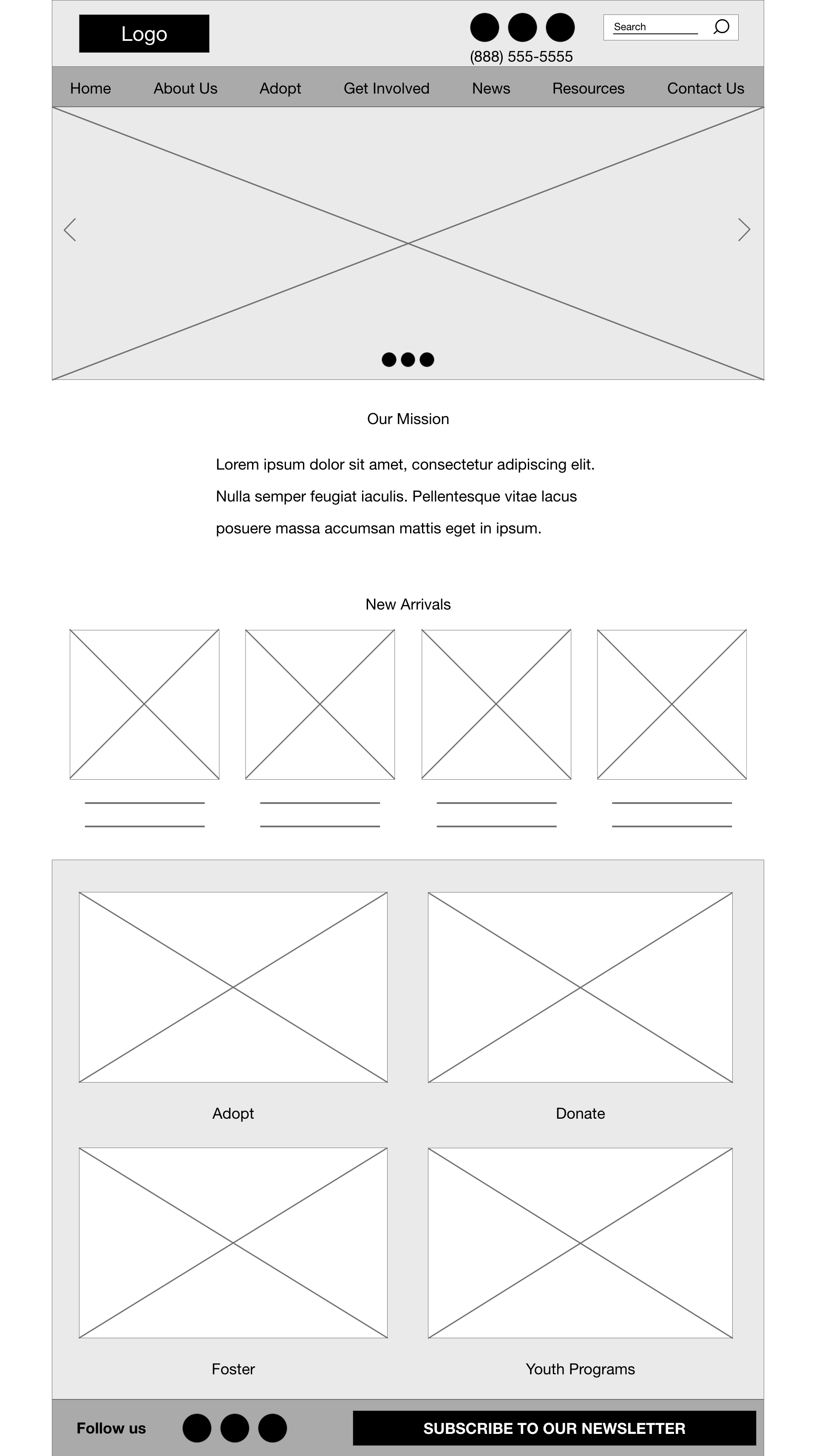
Digital Wireframes
The sitemap played an important part in fleshing out the navigation. Also, taking a look at competitors allowed for the digital wireframing structure to commence.
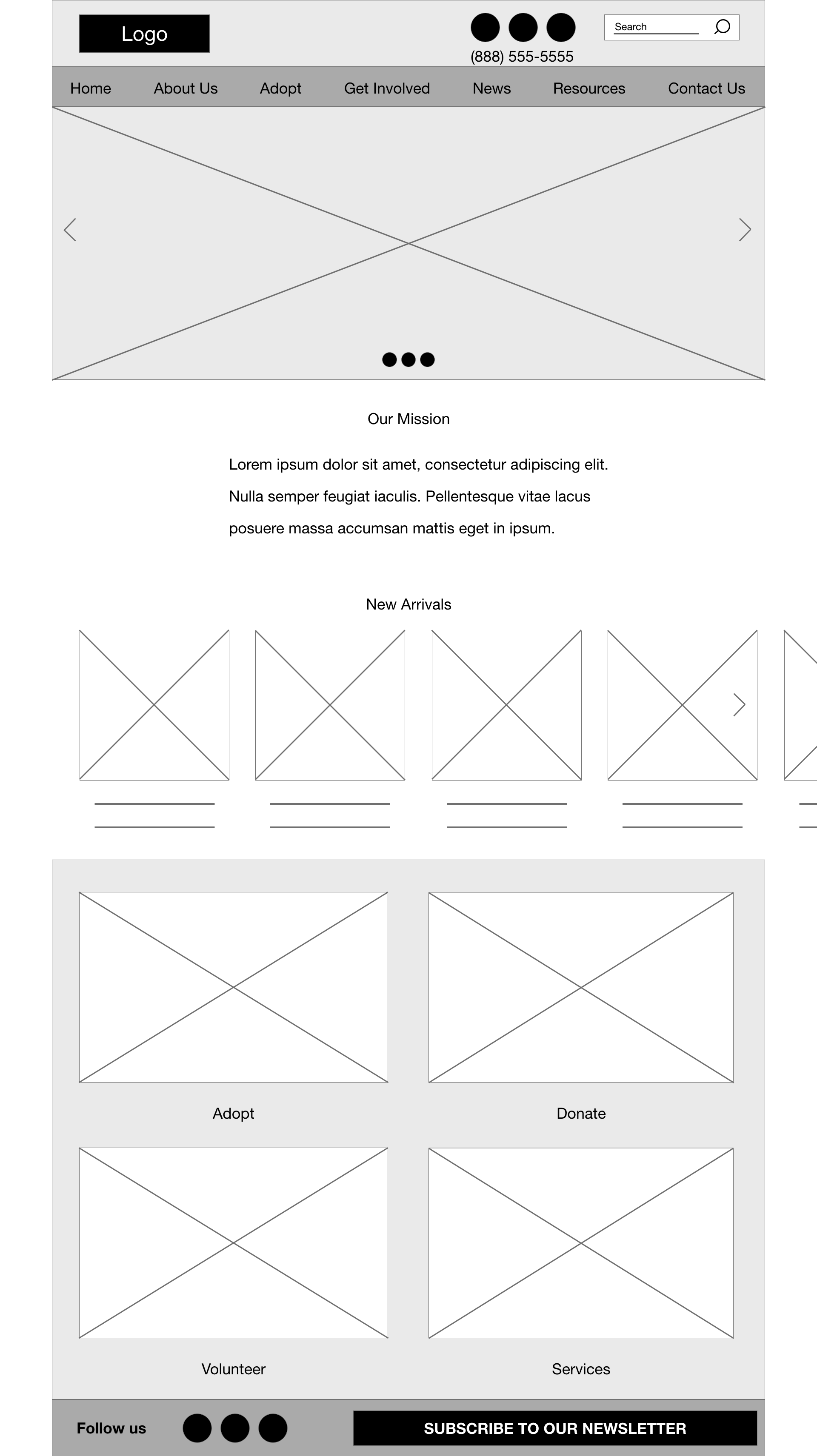
Modeled after the sitemap, navigation was built reflecting that model while being easily visible and accessible to the user during the user journey.
With user pain points and user habits in mind, key parts of the site map were replicated for quick navigation through a series of cards.
Digital Wireframe Screen Size Variations
Utilizing the paper wireframes of the Desktop and Mobile Handset Device, a lo-fidelity digital wireframe was built for both to help convert screen for mobile responsiveness.

Lo-Fidelity Prototype
A lo-fidelity prototype was created from connecting all the
wireframe screens in relation to the navigation built from the
original sitemap.
View the Petagogo lo-fidelity prototype

Usability Study Findings
Participants were not able to sign up for notifications.
Participants referred to the listed telephone number at the header for questions or frustrations.
Participants preferred seeing additional bio info on available pet profiles.
Refining the Design
Mockups
Based on the usability study, participants wanted a way to find and view available pets for adoption. Quick navigation access points were added to the home screen further down the page to assist with the site flow and navigation, making it easier for users to access.
Before usability study

After usability study
Access to pet profiles was important to participants, but more so the ability to make a reservation for visitation to meet an adoptable pet. A prompt to schedule a visit was implemented after findings from the user study and added to the hi-fidelity prototype.

Before usability study
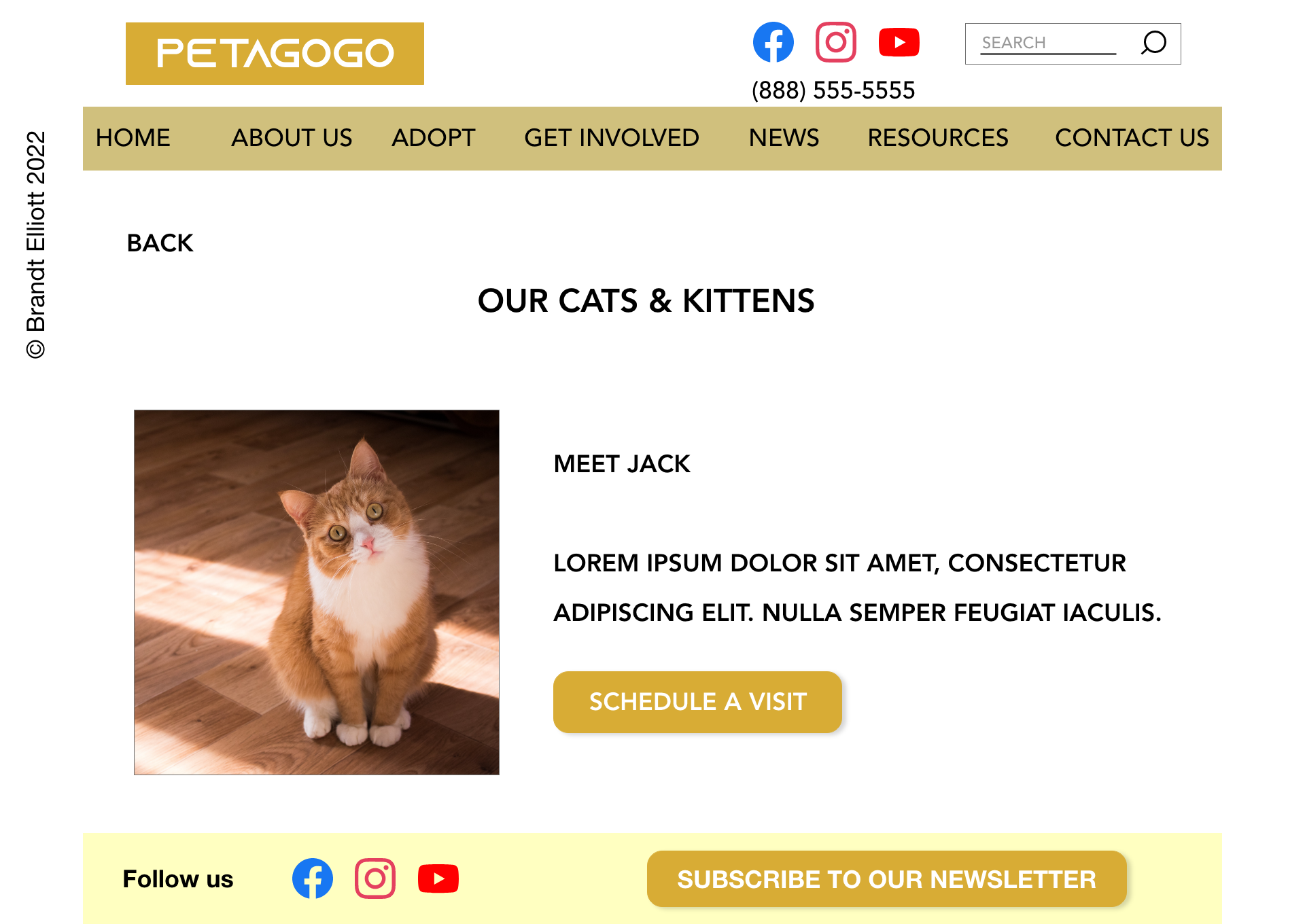
After usability study
Mockups: Original Screen Size


Mockups: Screen Size Variations
As a responsive website, UI designs focused on streamlining the flow for both Desktop and Mobile. Featured here is the home screen of the Pet Adoption Website Home Page in both hi-fidelity layout in both modes.

Mobile View
Desktop View
Accessibility Considerations
Hierarchy
Hierarchy was implemented to emphasize the use of text at different font sizes to help users differentiate floating content throughout the website flow.
Elements
Clickable elements such as buttons were rounded, colored and raised with drop-shadow effect to help move users through the flow by emphasizing a raised clickable object.
Hovering
Hover effect was used for drop-down navigation to show responsiveness for users relying on touch points or click devices to help move them through the user flow.

Hi-Fidelity Prototype
Utilizing color, images, font style and animations, navigation for the hi-fidelity prototype helped turn the wireframes in to a responsive website flow for the Pet Adoption project.
View the Petagogo hi-fidelity prototype
Going Forward
Takeaways
Impact
User study participants emphasized wanting to see images and information about adoptable pets, as well as the ability to make a reservation to schedule a visitation with an adoptable pet.
What I Learned
Through the usability study, participants emphasized the reliance of images and relevant text, such as a profile or backstory, about an available pet for adoption and that this information is important to them in making an informed decision about adoption.
Next Steps
Wireframes & Mockups
Build out the lo and hi-fidelity wireframes and connect the user flow for mobile view with the same user journey in mind as was tested with the usability study on the desktop version.
Animations & Text
Continue to improve on animations and replace “Lorem ipsum” placeholder text with content relative to the wireframe or card.
Prompts & User Flow
Build out subscription prompt and user flow cards for users to sign-up for notifications.